There is a special kind of risk that comes with touching a logo everyone already knows by heart. Coca-Cola learned it again this month. The company unveiled a refreshed global visual identity built to hold together across more than two hundred markets and every screen size a person might carry in a pocket. The work was disciplined and, by most design standards, good. Then the internet did what the internet does, and within a day the conversation was not about Coca-Cola at all. It was about Marlboro.
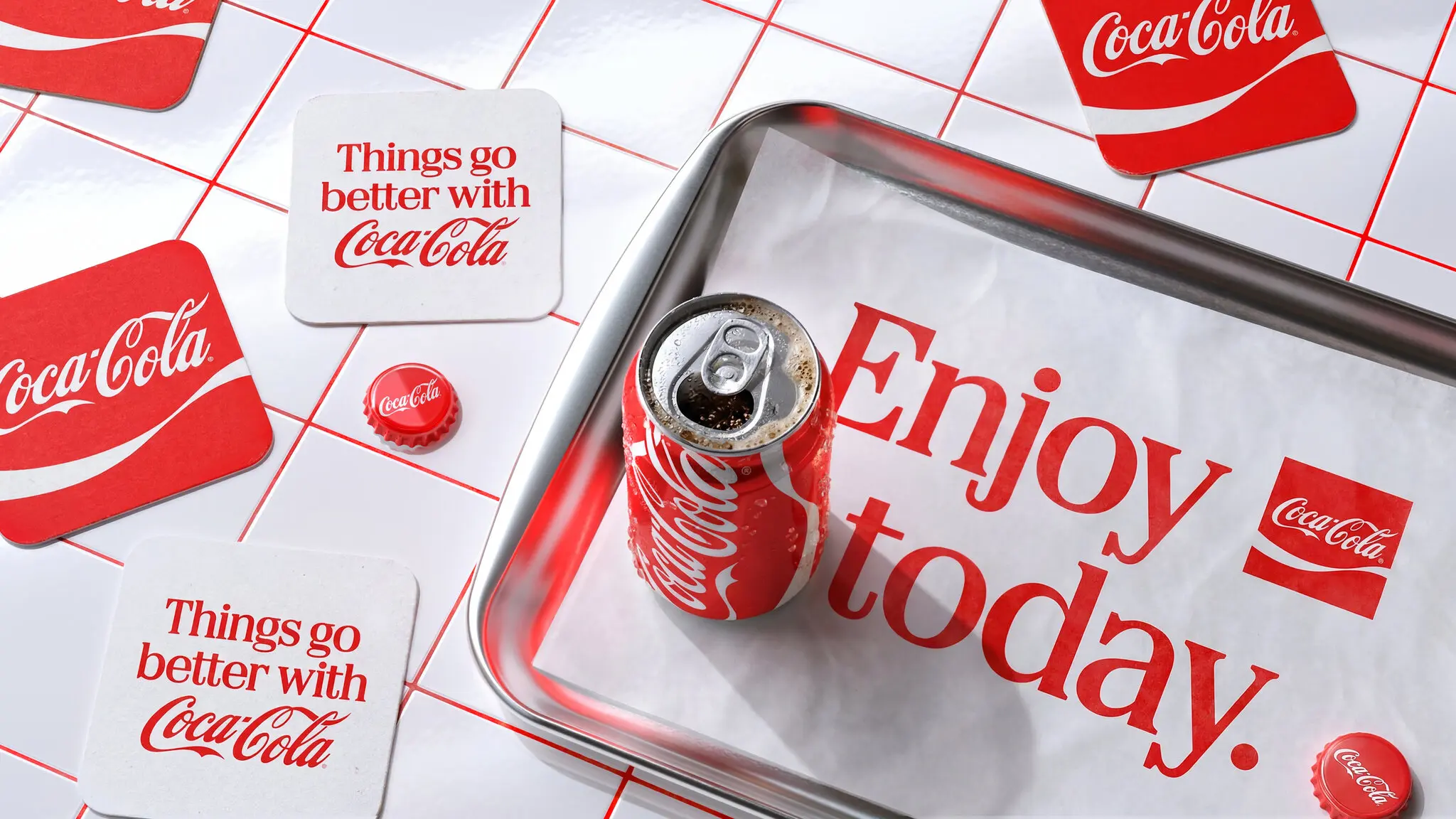
The comparison spread because it was easy to make. Bold red, clean white, a confident block of serif type sitting on a tiled backdrop that read like a diner counter. Put the new Coca-Cola headline lockup next to a pack of cigarettes and the family resemblance was hard to unsee. Soda is the new cigarettes, people wrote, half joking and half not, and the joke stuck because it landed on something real about how both products have been sold for a century.
What Coca-Cola actually changed
It helps to separate the redesign from the reaction. The heart of the brand did not move. The Spencerian script, the flowing ribbon, the red and white palette, the squared frame the company has leaned on for years, all of it stayed. What changed was the system around those assets, the connective tissue that decides how the brand behaves when it is not the famous logo but a headline, a caption, a coupon, or a single frame in a fast scrolling feed.
That is the unglamorous problem every heritage brand faces now. A mark designed for painted signs and glass bottles has to survive as a tiny avatar, a video bumper, and a thumbnail competing with a thousand others. Coca-Cola answered with a tighter set of rules and a bolder supporting typeface meant to carry short, declarative lines with authority. Enjoy today. Things go better with Coca-Cola. The words are vintage on purpose, and the delivery is engineered for a screen you hold in one hand.
Why the Marlboro echo is not an accident of taste
Here is the uncomfortable part for the design team. The resemblance is not really about one font choice. Coca-Cola and Marlboro drank from the same well for decades, because they were built by the same discipline in the same era. Both learned to strip a message down to a color, a shape, and a feeling, and to repeat it until it became furniture in the culture. When you optimize a modern identity for maximum recognition with minimum clutter, you tend to arrive back at that vocabulary, because it works. The market keeps rewarding it.
So the visual rhyme people spotted is less a copied letterform and more two brands converging on the same proven grammar of desire. Red for appetite and urgency, white for cleanliness and calm, a heavy nostalgic serif for permanence and trust. That grammar was refined to sell cigarettes as freedom and to sell soda as happiness. Reuse the grammar and you inherit some of the memory attached to it, whether you asked for it or not.